SpringLight Education Institute Company Identity Project
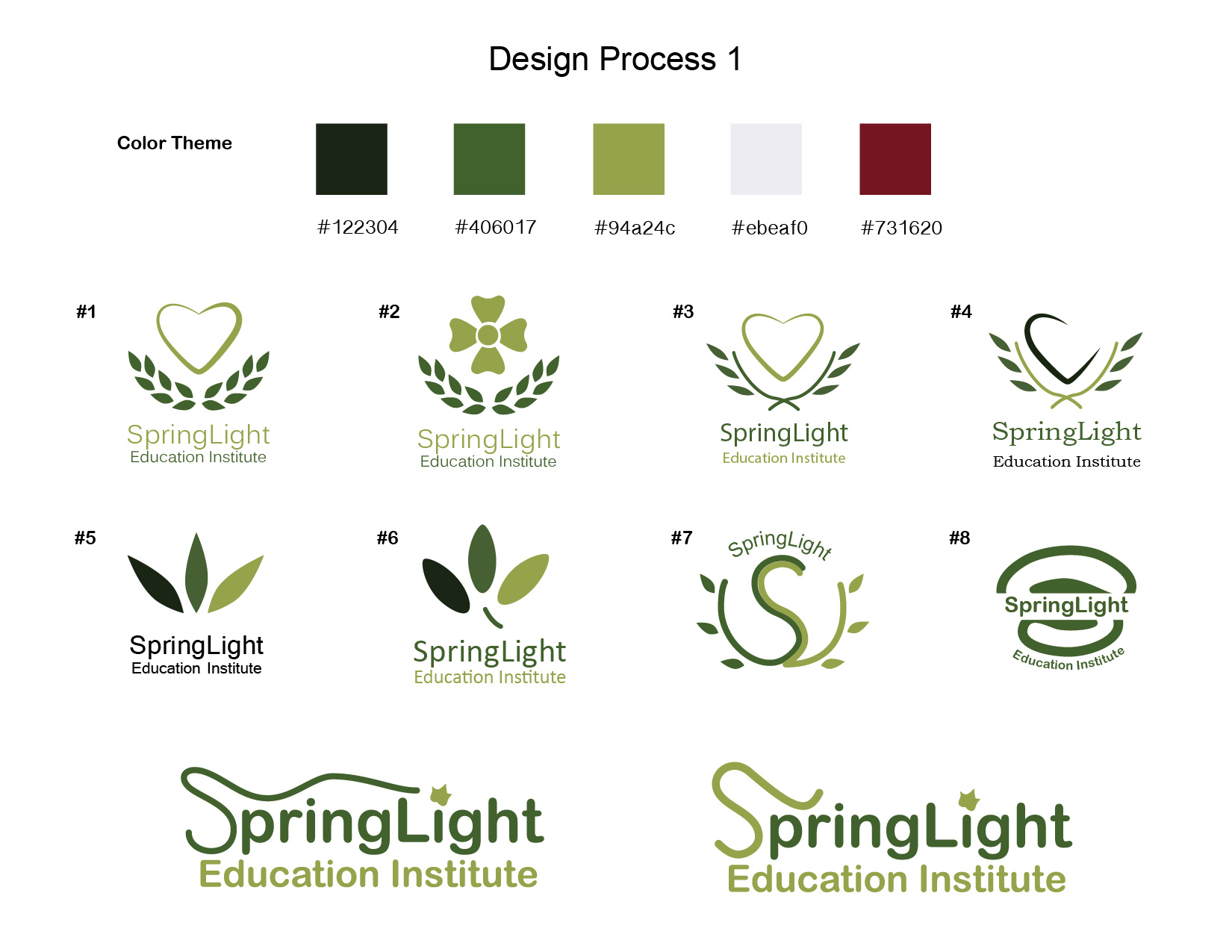
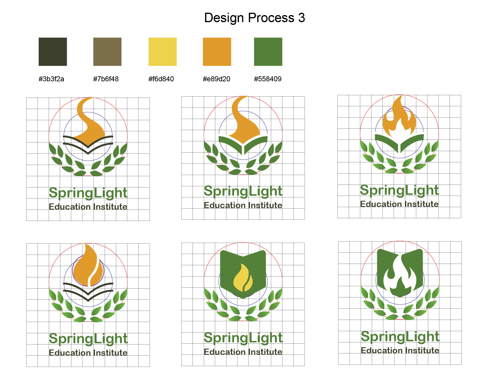
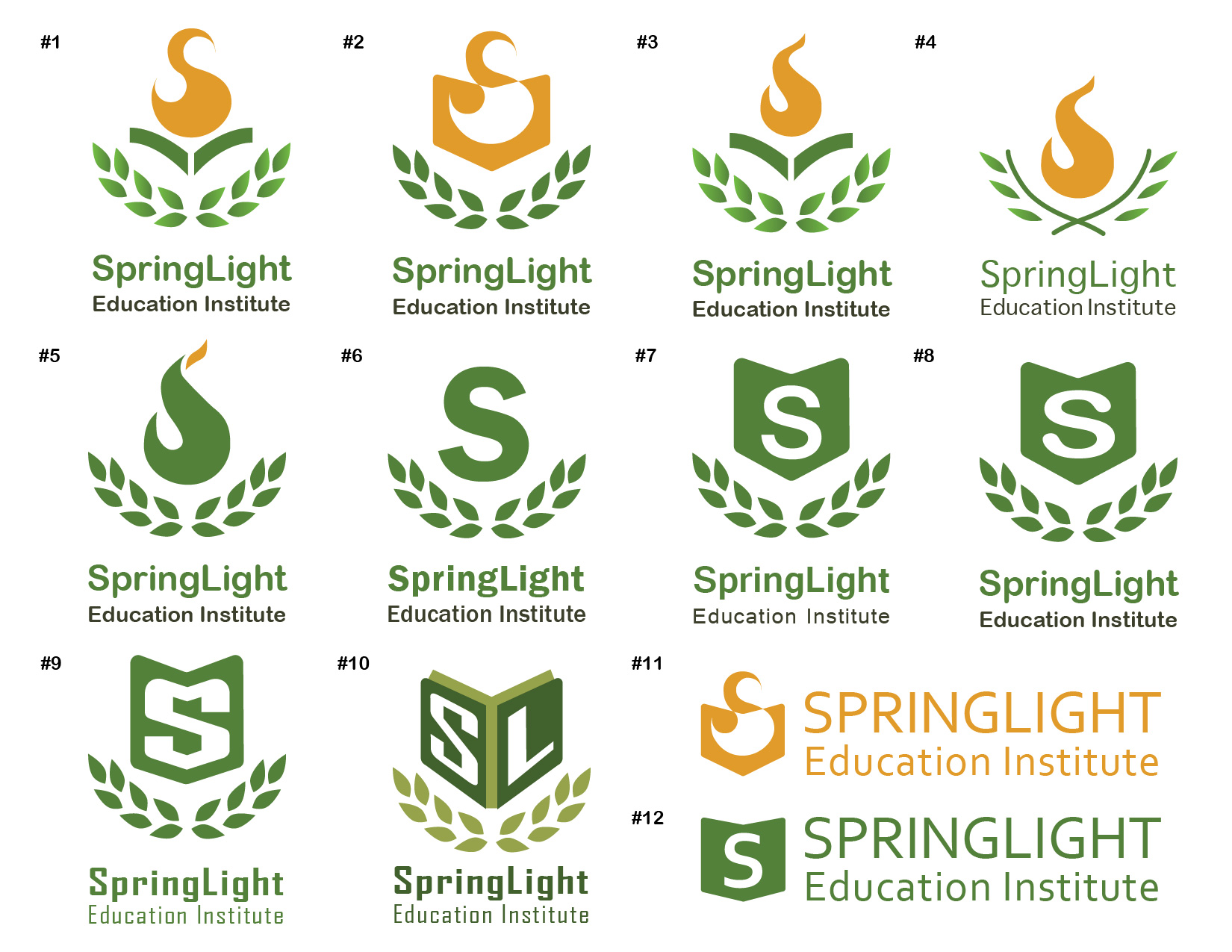
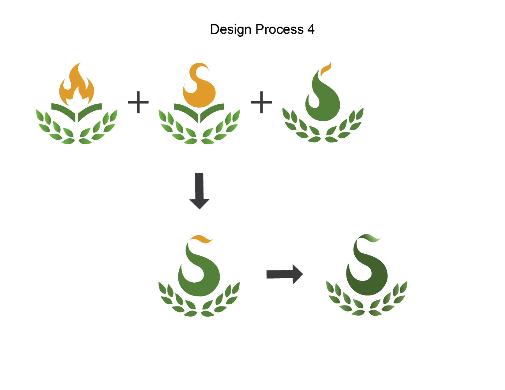
SpringLight Education Institute provides college consulting service, many different courses, and educational information to students from elementary school to high school. The company identity design project aims to create a guide line of the company’s image and make everything consistent, including logo, website, flyers, and other promotional materials. Logo as the core, represents a memorable image of the company, and indicates its spirit which is “faith, hope, and love”. The separated top part of the “s” comes from a lamp and candle, and represents fire, light, and hope. The green color represents spring, and olive leaves indicates education. I also designed the company’s website in a two people team, and my duty include front-end design, create site map, organizing all the contents, photography and picture editing.
Visit SpringLight Education Website